Have you ever wondered how the color of your home’s walls impacts your mood? If you’ve walked into a room with orange walls or accents and suddenly felt hungry, or into a room painted with soft blue tones and immediately felt calmer for some strange reason, you’ve experienced the often powerful impact of color on moods.
You may remember the color wheel from elementary school science class. You may even know that warm colors make things feel smaller and cozier, while cooler colors make things seem larger and airier. Light colors appear to bring things closer, while darker shades make things seem to recede.
But specific colors can also have individual effects on the way people feel, especially when they’re surrounded by four walls in that shade.
How Does Color Work on Mood?
Color psychology as a field of study has been around for hundreds of years. Ever since Isaac Newton discovered the color wheel’s properties and organization in the late 17th century, we humans have noticed the various ways different colors trigger different emotional states.
Sometimes, these effects are based in personal experience, much like certain smells can evoke feelings and memories. You may feel nostalgic about a specific shade of green, for example, because it was the color of your grandmother’s favorite dress. Or a certain shade of blue makes you feel nervous because it reminds you of the color of the walls in your high school principal’s office.
But colors also affect people in general ways, and there’s some scientific research that indicates some colors have the same effect on mood in most people.
Let’s look at some of those effects and the colors that trigger them, and check out our posts on kitchen color inspiration for a few examples on how to apply it to your home remodeling projects.
Red: Passion & Intensity
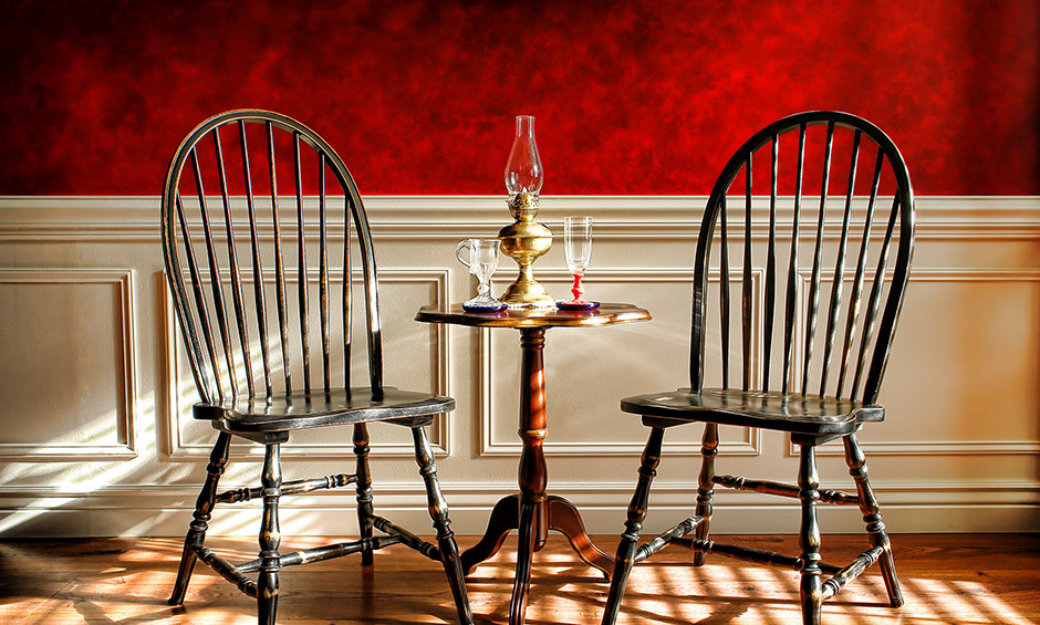
Red walls can instantly make a room’s occupants feel more energetic and intense. If you plan to use a specific room for social gatherings and entertainment, especially in the evening, it’s a great choice. You can also use red anywhere you’d like to draw people out of their shells and into group conversation.
For the same reason, you’ll want to keep red out of most bedrooms, where cooler tones are generally preferable.
Red paint tones are best utilized in social rooms that will see a lot of traffic. Living rooms, dining rooms, and other rooms in which folks will gather in groups are great choices for red walls.
Blue: Peace & Tranquility
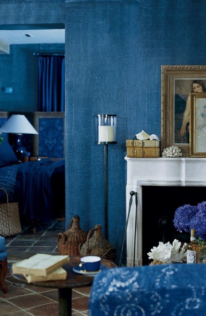
If you want to calm folks down and imbue a room with a sense of serenity and peace, you can’t go wrong with most shade of blue — if you’re cautious about the exact tone. It’s also a great color for bathrooms.
Some blues, especially on the more pastel end of the spectrum, can look a little cold and icy on the walls in large chunks, especially if the room doesn’t get a lot of quality light. One way to counteract that effect is to add small accents in warmed complementary tones — for example, in throw pillows or grouped collectibles.
The darker the blue, the less peaceful the room will feel. That might be a good thing if you’re painting a room where serious business or study will take place. In libraries and offices, a deep blue might be a great choice.
Orange: Appetite & Energy
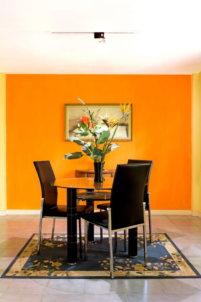
If you want to stoke appetites and create more energy in a room — say, a kitchen or dining area — look at shades of orange such as saffron and salmon.
Orange arouses excitement, hunger, and enthusiasm. It might be too intense for a living room, and for the same reason isn’t a great choice as a leading shade for your bedroom’s color scheme. But for dining rooms, kitchens, home gyms, and other more physical and active places, orange can be a great choice.
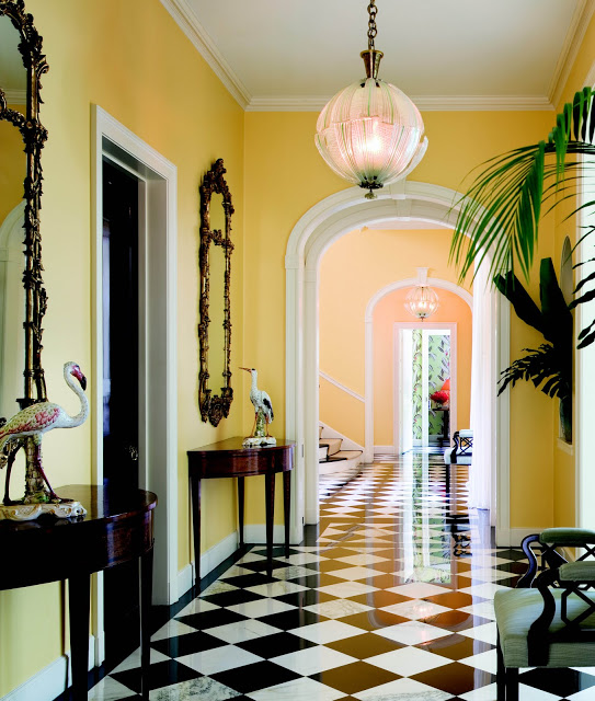
Yellow: Happiness & Socialization
Is there any happier hue than the color of sunshine? Well, in actuality, there could be a lot of them! As it turns out, yellow is a great example of how sometimes, the effect of a color on mood can actually be counterintuitive.
To most people, yellow evokes feelings of warmth, compassion, joy, and goodwill. It’s a cheery color, which is perhaps why a lot of people choose it as a gender-neutral tone for nurseries. However, this might be self-defeating, since some studies suggest babies actually cry more in yellow rooms. Adults also aren’t necessarily immune from that feeling, since many folks report feeling angrier in yellow rooms.
One way to maximize the happy impact of yellow without triggering that aggravating impulse in those prone to it is to restrict yellow to entryways and smaller rooms that host transitional traffic — i.e., hallways, cloakrooms, etc.
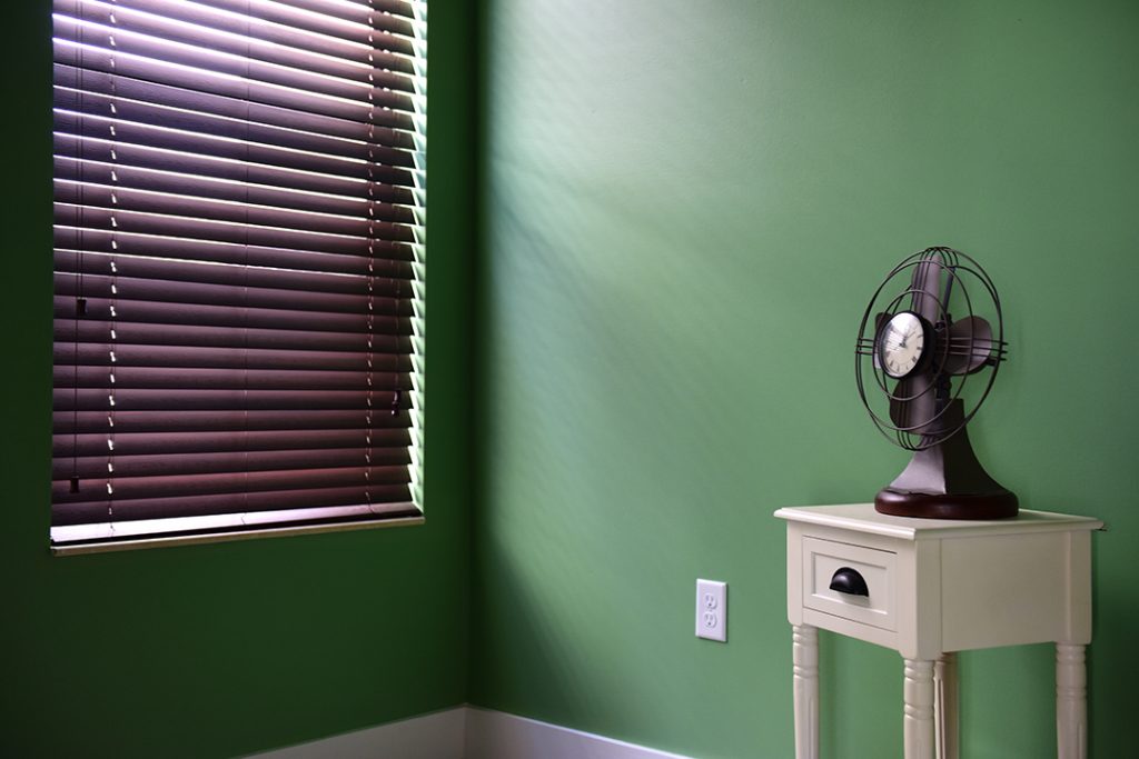
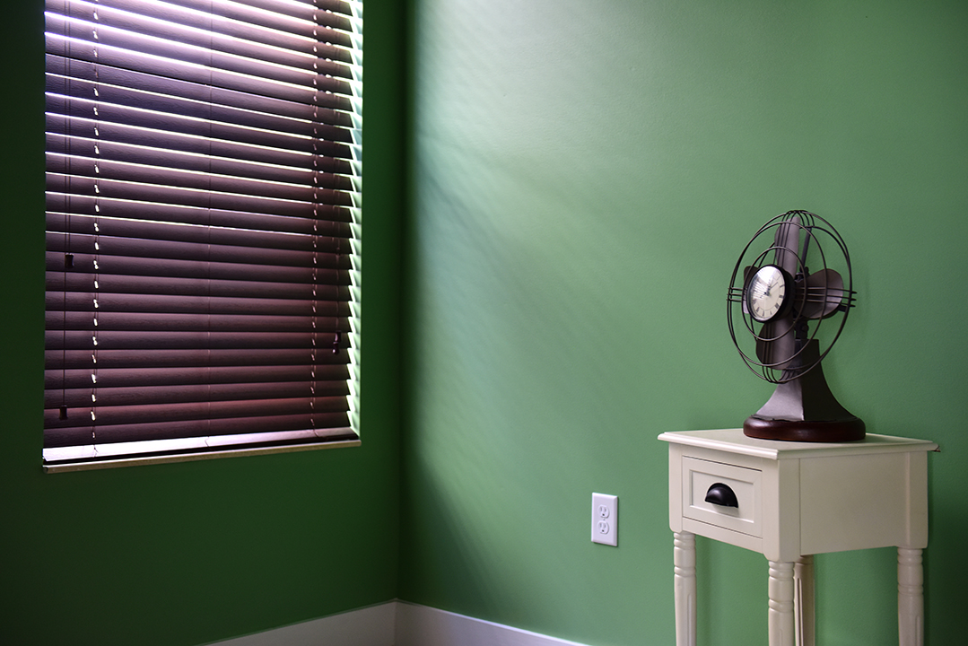
Green: Restful & Rejuvenating